
WELCOME TO YOUR EXOTIC PALETTE

examples of EXOTIC outfits
Your palette is WARM, DEEP and TOASTED.
The warm toasted colours of the rich Exotic palette are inviting and generous. The evocative nature of this colour group welcomes communication and will make everyone at ease. When shopping for your garments ensure that what you chose has a soft richness and warmth reminiscent of a delicious meal peppered with exotic spices
USING YOUR COLOUR SWATCH
Rather than throwing out your entire wardrobe out (don’t do that!) from here on in, try to make sure that everything you buy harmonises with the colours in your colour swatch. Longer term, this will ensure that your wardrobe mixes and matches and you’ll know everything suits you too.
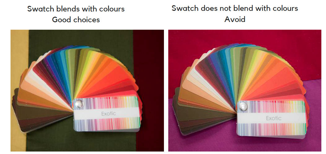
To know if a colour is right, place your swatch onto the colour/s or patterns you are looking at. If the colours are similar in intensity and undertone, there is a natural feeling that these colours are from the same colour family and blend. If your swatch stands off or doesn’t harmonise, then the colour you are looking at is not a good match for your swatch.
There are a multitude of colours available to you. Your swatch is just a snapshot guide to the kinds of colours you are looking for. Think of your swatch as an executive summary - there are around 50 000 colours you can happily wear - this is just a small sample to show you the kinds of colours you are looking for. You don't need to match colours exactly, they just need to belong to the same ‘family’ - the swatch almost sinks in to the right colours. .
WEARING YOUR COLOURS
Wardrobe Basics
Neutrals – Warm chocolate, olive, tan, camel, khaki, marine navy, cream
Interests – Rich tomato red, red-violet, orange, mustard, warm teal, asparagus green, warmly toasted coral
Best Denim
Medium-dark warmer denim
Best Metals
Gold, rose gold, bronze, copper, brass
Best Glasses Frames and Lenses
Choose frame colours that are from your metals range – gold, rose gold, bronze, copper or brass, or a metal frame in a warm colour such as orange, tomato red, or even olive or turquoise. If choosing plastic frames try tortoise-shell or another yellow based colour. The colour of the lens for sunglasses must be warm – yellows, browns, bronzes – avoid blues, grays and black.
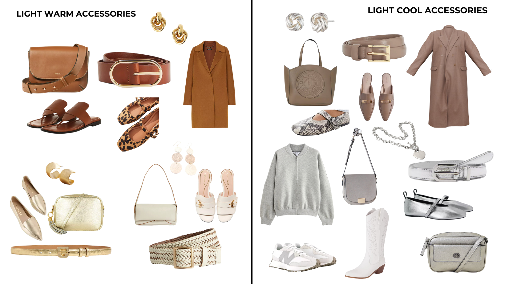
Investment Buys and Accessories
Choose your best neutrals for investment buys. These neutral colours don’t date as quickly as fashion colours.
The best colour for shoes, bags, coats and belts is one that is similar or tones in with your hair colour or is one of your signature colours. This is because you are always wearing your hair and because these items are worn over many other colours and with many outfits, your hair colour is the most versatile colour.

Universal Shoe Colour
When in doubt, and when not toning shoes to the hem of your trousers or matching your tights, choose a shoe in a similar tone to your hair colour to create a pleasing visual loop from face to feet and back to your face. If you want to wear a coloured shoe unrelated to your hair colour, ensure that you repeat the colour in a top or accessory near your face to draw create a pleasing visual grouping effect.

HOW TO WEAR BLACK
Black is not a flattering colour for you as it is cool and bright and you are warm and softly toasted. Ideally only wear it at night, in fabrics that have a softened sheen such as silk, or fabrics that show some skin through such as lace or mesh. Keep black away from your face so as not to create unflattering shadows. Even if you wear it on your lower half, it will still draw attention to itself as it is unrelated to your palette.
How to Wear Colours that Don’t Fit into Your Colour Palette
If you follow these set of rules you will always look great.
Keep it as far as possible from your face
Wear another colour between it and your skin
Keep the less than perfect colour to only 10 -20% of your entire outfit
Wear it below your waist
Any colour of the same intensity and value as your colouring is easier to wear than one that is markedly different
Use your ideal level of contrast and ideal value in the outfit you are wearing to lessen the impact
Wear a lower neckline
Wear more makeup
Wearing Your Colours Your Way
Not all the colours in your palette may work well worn as a single colour above the waist, so you may need to wear additional colours or garments to add greater interest. For example, whilst your palette may contain light neutrals, these may not look the best in a block of colour on your upper body, however, if teamed with a scarf, necklace, or additional interest colours from your palette, it may work well.
Using the Colour Wheel to Create Colour Combinations
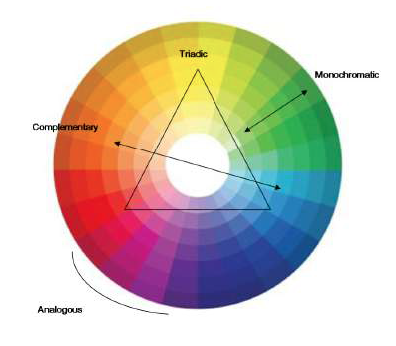
Colour wheel
1. Neutral Plus – one or two neutrals with a colour.
2. Monochromatic – colours in the same shade but different lightness or darkness e.g. a variety of blues together.
3. Analogous – 2-3 colours that sit next to each other on the colour wheel, such as green with blue or navy with violet. Mix back with a neutral from your palette.
4. Triad – take 2 corners of a triad (see colour wheel), such as red and blue, and wear with a neutral to create a great colour combination that is easy on the eye. Great options include violet and green or yellow and blue. If you feel really adventurous you can add in the third colour of the triad.
5. Complementary – take two colours that are opposite on the colour wheel such as pink and green and team with a neutral for a bold look.
Always make sure when mixing colours that they are not combined in equal ratios, but instead try the 60/30/10 rule.
Easy Colour Combinations
Here are just a few possible colour combinations to consider when dressing – this list is by no means comprehensive, but may help you think outside your normal colour combining when dressing.
Camel– mixes with lots of different colours - red is traditional, blue is peaceful, navy is authoritative, orange is fun and playful, green is refreshing and yellow is cheerful.
Olive - Another great warm neutral, the darker it is the more businesslike, the lighter the shade the more casual it becomes. Olive teams beautifully with coral pink, peach, turquoise blue and yellow. For a more creative look wear olive greens with orange or red-violet.
Warm Green Grey – looks great with a pop of colour to brighten it up. You can also mix it with other neutrals like camel and beige, cream and marine navy. It also works well with colours from violet through to yellow. Grey mixed with a light pink is seen as sociable, lilac is amicable, blue is conservative and with red it is energetic.
Brown mixes well with beige for a relaxed look, red for a dynamic appearance, greens to be restful, blue for calmness and looks great with peach and coral pink.
Navy – mix it with red and white for an understated look, mauve or violet work well and are a more creative mix Pink looks preppy, a mid blue will create animation, whilst blue stripes are upbeat.
EXOTIC HAIR
When colouring your hair – for a natural look choose any of the following, or a combination from this list:
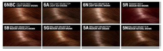
EXOTIC hair colours
Auburn
Deep Copper
Mahogany
Caramel Brown
Golden Brown
Warm Chocolate
Disguise any grey with highlights in warm colours to such as in honey blonde, caramel or gold-copper. Avoid adding any ash or cool colour to your hair, be it a highlight in ash or cool platinum. Stay right away from the grey tones
When you are deciding on hair colour, hold a swatch of the colour up to your skin to see if the colour is flattering for your particular skin tone.
EXOTIC MAKEUP
Foundation: match to skin
Blush: Peach or coral (avoid anything pink or rose)
Eye Shadow: Base- beige, copper, nude
Contour: soft warm mauve, warm browns, olive green
Highlight: gold, peach
Eyeliner: Deep brown, aubergine, marine navy, teal, olive
Mascara: Black brown, brown
Lipstick: Coral, brick wine, tangerine, copper, tomato red, browns

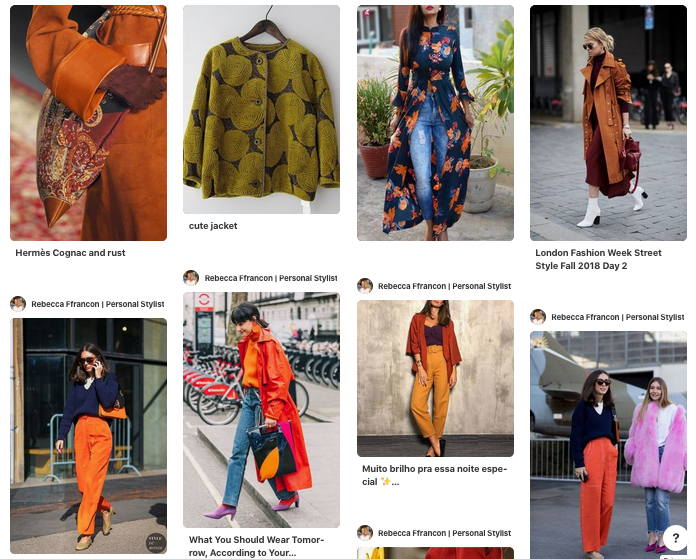
EXOTIC PINTEREST BOARD
Click here to see my Exotic Pinterest board for more inspiration of colour combinations.